The Real Impact
of Data Visualization for a Sales Team
A distribution company implemented a new dashboard for its sales team. One of the main objectives was to encourage a healthy competition between its key account managers (KAM).
The new strategy focused on the ABC segmenting model and the average invoice value per segment. Selected KPIs were measured and the sellers with the top results were the ones who were consistently following the new strategy.
As a result, the distribution company realized that the best way to convince fans of the old model was to transparently display the results so that they could see them for themselves.
A simple dashboard
to compare KAMs’ performance
We designed a general dashboard page where anybody could analyze and compare the performance of different sellers. It also featured an individual page with detailed information about each of the KPIs. Making it available to the whole team served not only the KAMs but also their colleagues who were in need of some inspiration.
With great power…
Salespeople are usually proud and self-confident with big personalities and even bigger egos. Competition is inevitable and the only viable option for management was to embrace the challenge and to guide the process by making the competition as fair and transparent as possible.
Data visualization comes with a secret weapon which is the psychological effect of having a specific goal in mind. The KPIs that you select set the mood of the company and the theme of the competition, but like any other secret weapon, with great power comes great responsibility. Companies need to be fair and to keep the competition healthy, and software is a great way to do just that.

The challenge
Accurate measurement
How do you accurately measure the performance of people who are responsible for different territories? There are several options:
1. Versus target. Since the target revenue is the root of all sales KPIs, it only seems fair to have it right up front. However, life isn’t perfect and neither are sales teams. In real life, a seller who is newly in charge of a region that was poorly handled by his predecessor might create the illusion of being a sales superstar while the reality is very different.
2. Total revenue. The overall revenue is, of course, one of the most important KPIs, but it’s important not to simply favor the KAMs who work the richest markets. You need to also factor in the industry, the region and other factors that can influence the overall size of the market.
3. Growth percentage. While these dashboards allow KAMs responsible for smaller markets to compete head to those with those from larger markets, you risk allowing one KAM to have an unfair advantage over another if they get a deal that’s huge for one person and relatively small for another.
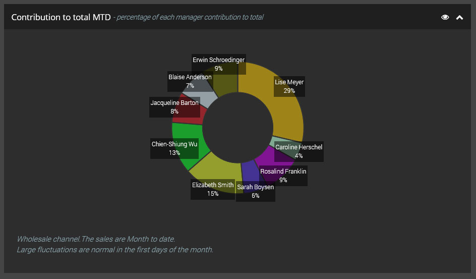
4. Individual contribution to company growth. This model was designed after months of observing how the internal competition was evolving. Its introduction, if only as a data visualization tool and not as a measured KPI, brought about an equilibrium between competitive sellers (see Picture 2).
More details follow in the next section.
The solution
All plus one
With fairness and transparency in mind, as well as the need to address internal political wars and to guide staff towards a healthy competition, the final design of the dashboard included four elements (as seen in Picture 1).
- Percentage of target
- Individual revenue per day comparison graph
- Growth in net and in percentage (as a table with sort capability)
- Individual contribution to company growth.
The fifth and final element solved the debate of what’s more important (i.e. net/percentage, year-to-year growth, target achievement, etc.). However, it came with additional complexity due to the algorithm used to compute it. We had to figure out how to run calculations when at least one KAM had negative growth and you had to distribute the loss between the performers.
The complete set of five KPIs helped the company to achieve its main objective: creating a healthy competition between sellers based on transparency and fairness while tying in with the company’s strategic goals.

Don’t try this at home
It might not work for everyone
This case study represents a small part of a larger project. It doesn’t represent our professional advice on any given situation and may not be applicable to any other company. Every company is different and without taking a look at the bigger picture, the solution shown here might not work as intended.
Working demo is available upon request.
If you’d like to know how to apply the techniques from this case study to your company then get in touch.
We’d love to chat to you about your business challenges.
Got a cool idea?
Let’s talk and make it happen. The coffee’s on us.
